Tuesday, May 08, 2012

Beginning the Process Once Again


So, after 2 years, 3 moves and building a new house from the ground up, I am once again ready to paint, draw, sketch and just plain try to be creative.  I have not painted anything with pastels in almost 5 years (how sad).

Before the Studio


The new house has a room set aside to be my studio, but before I was able to set it up I was drawing at the kitchen peninsula.  Not what I had initially intended, but a good place to start.


What to Draw? The Inspiration.

As I had not drawn anything in over 2 years, it felt as if my creative brain had atrophied. After several failed start/stops, I decided to use my favorite splash page from Mouse Guard as a kind of drawing exercise, much the same way one would do word problems to learn math skills.  I have done this from time to time when I am more interesting in learning a technique or playing with new tools or media.


The Tools

The last few Christmas I asked for and received many art supplies, including watercolor pencils, Cotman travel watercolors and micron Sakura Micron colored pens.  This choice of picture subject matter also allowed me to play with all these toys.


The Initial Drawing

The initial sketch was completed quickly and the drawing was inked with the Sakura micron pens (0.25, 0.45 and 0.50 mm black). Simple, yet fun.


The picture was painted using a combination of the watercolor pencils and Cotman pans.  I used the colored microns to add details to the leaves in the tree and on the sword.  David Petersen, the creator-artist of Mouse Guard, is such a talented artist, even my pale copy of his his wonderful work is actually pretty good.  Eventually, I will create original works using this technique, which was quite fun and can be done virtually anywhere.


Friday, June 19, 2009

Finally, something new - Tiger, unfinished pencils


So, I have not finished this yet but it does represent something that I have worked on in the last few months (not going thru the archives of older paintings and drawings). I actually had wanted to add water color and water color pencils to a light pencil sketch. But, ah, I drew this on the cover sheet of the water color pad and not the 40 lbs paper. The cover sheet will not accept water, therefore it has become a more complete sketch.

It is hard to see the rest of the torso, but I have laid it out, along with the stripes. I was actually beginning to worry that I was losing my ability to sketch and draw. But I am pleased with this thus far.

Hope you enjoy.

Saturday, June 06, 2009

As My Dreams Died-redux


The partner to "Ever Wistful" was "As My Dreams Died". A bit melodramatic, but hey, I liked the way this looks with the original poetry finally added.

This time I used Keynote instead of Photoshop. For what ever reason I could not get the font to fit in Photoshop properly. Keynote is a pretty neat program and I am enjoying learning how to use it.

Tuesday, May 19, 2009

Ever Wistful


I did this picture (color pencil, ink and pastel 9X12") back in college for a friend. At the time (summer of '94), I did not have access to a scanner and any kind of photoshop-like program to integrate the poem that went along with it. They had to settle for a painting and print out of the poem. As I was cleaning today, I happened a color copy of the original drawing and decided to add the poetry.

This is close to my original intent (not sure if this is the best font, but it will do for now) of the painting and words. I did two paintings with poems back then. I will work on the other this week.

And I have been working on a new pencil sketch. Hope to have it up in about a week.

Tuesday, April 21, 2009

Before there was Clip Art. . .


Doing presentations in graduate school in the early nineties (aka the dark ages) meant black and white over heads, not powerpoint (or keynote for you mac users) presentations, with photos and color graphs and builds and animations and imbedded video files. It was primative. Toward the end of my schooling, powerpoint became more common. Hell, I can remember glass slides (although I have sleeves of ppt slides that I will never ever use again but can not bear to throw out).

The point? Since I there was no such thing as clip art and I could draw, my friends were always asking me to draw little pictures that they could include on their overheads. Recently I found a book of such drawings.

The "take home" message was a favorite expression of a professor of mine (who loved to verbally spar with me, in a collegial way) and the caricature bears more than a passing resemblance to him. Score one for me (and my sartorial splendor!!).

And the reason the guy doing push ups has a ball and chain on his leg is because my buddy was giving a lecture on proper exercise at a correctional institution. He said they loved it.

Wednesday, April 15, 2009

Gahlmaar the Fallen


Probably the most vile villian of the D&D campaign I ran with my college room mate was the fallen ranger, Gahlmaar (version 1 is what the raw pencils look like; version two is the b&w version). He is the ultimate sore loser as he betrayed his friends, his god and everything he believed in simple because he felt disrespected and under utilized. In a pique of anger, he slew the unicorn god, Elasmothera, and violated the sacred grove (now the forsaken Heart of Stone). He took Its horn as his weapon and symbol and wears its skin as his armor. He rules his huntsman with an iron fist. Basically, he is one nasty, indignant SOB.

Thursday, April 09, 2009

Re-Learning to Paint in Pastels

Ocean in Purple (pastels on paper 5 1/2 x 8 1/2 in)


Simple Spring (pastels on paper 5 1/2 x 8 1/2 in)

Back in the mid-nineties when I was trying to, essentially, "re-learn" how to paint in pastels I started by making small paintings (5 1/2 x 8 1/2 inches). What do I mean by re-learn? When I was in grade school, I just painted and drew and had fun. I took some lessons and improved. The work was quite good (wish I had some proof of these comments but all those originals are lost). My high school had a commercial art program and I thought I would become a professional artist. Well, that did not happen. I dropped out of the program, graduated high school, went to college and earned a non-art bachelors degree and pretty much did not paint or draw for about 5 years. My art skills atrophied incredibly.

But I missed drawing and painting. So, I began small. Above are some of the first pieces that I tried. Not very good but, as the legend says, they were not The beginning, but they were A beginning.

Tuesday, April 07, 2009

More old D&D artwork


Beyond the Otyugh I also did a host of other drawings for our game. Unfortunately, only a few of these still exist. Have no idea what happened to the original pen and ink drawings. Above we have the pen and ink drawings, "George and the Dragon", "Goblin" and "Draco" (man, was I awful at naming files).

For me, it is fun to look at these again and think about that time in my life but also look at how my art style has evolved, from technique and media to subject and quality. From high school to early college I was in love with line work (thank you Ronin by Frank Miller). While I never fully embraced "speed lines" I did so love cross-hatch. I still do, though on those rare (but hopefully increasingly) occasions, use cross-hatch as primary shading technique. Just not as much.

I am going to post a few more old pieces and then hopefully get to some new, original work. That is the plan at least.

Friday, April 03, 2009

Otyugh from waaay back when


Wow. I had did these drawings back in college for the D&D campaign my room mate and I ran. I lost the originals but had them scanned into my old Mac IIci (the height of cool in the early nineties). I have not been able to open the files in years.

Fast forward to now and with my new iMac and Photoshop I have open these files for the first time in probably 10 years. I think these would be great projects for me to learn how to layer colors in photoshop.

Here is my version of a crazy otyugh. To be honest, not sure if this is a swipe, an amalgamation or just me. Looks pretty cool, tho'. Waddya think?

Thursday, March 26, 2009

Iron Man and Spidey


When I asked my nephew which characters he wanted me to draw, he said, not surprisingly, Iron Man and Spiderman. I tried a slightly different approach than used on the Cap and Hulk pictures (done in water color pencils and ink, btw). Instead of laying the color down on the pencils and then inking, I inked it first. Thinking this is a big mistake.


Why did I do this? Well, I thought it would be too difficult to ink the Iron Man armor features. Will not be doing that again. Should just have more confidence in myself I guess.

Tuesday, March 24, 2009

Sketch of The Knight and the Barbarian


I found a whole host of old pencil sketches that I did back. . .well, when I was in my teens. I am not sure if I ever posted any of them but even still, I think some of them are cool.

And as you will quickly tell as I post these old pictures, this was a time in my life where I was not interested in doing any kind of background. Guess that is why I started painting in pastels to take on this challenge.

Thursday, March 19, 2009

Captain America


Yes, I know. . .I should stop doing swipes and start doing real drawings. At this point, they are more mental exercises than anything else. Still, this was fun to do.

Monday, March 16, 2009

Hulk (after Byrne)


So, I wanted to try and do some comic book type art and play around with watercolor and ink. Who better to swipe than John Byrne?
Hmmm. . .can not seem to get the images in the proper progression, but you get the idea.

After a long hiatus. . .

It sure has been a long, long time since I posted anything here (I changed jobs, moved etc. . .) but wanted to put up a few things that I have worked on during my hiatus.

Unfortunately, I packed my pastels away (and they will be in storage for a while) but have been playing around with water color and ink. I will try to post a few of the experiements and some newer stuff as well.

Tuesday, April 03, 2007

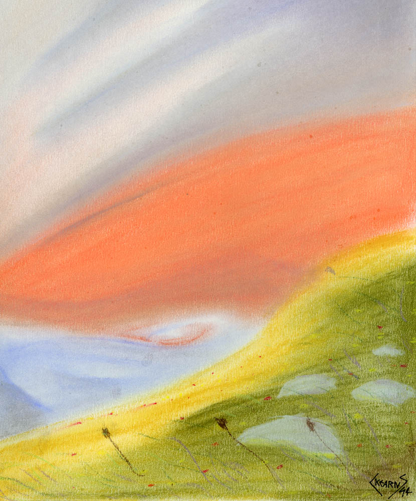
Path Ends


Obviously, I have not been very productive in terms of painting. . .

::sigh::

Life does happen.

Here is something that I completed a few months back, in a much, much looser style than normal. I tried to take advantage of the durability of Ampersand's pastel board, it really stood up to a beating. . .and lots of color.

Enjoy!!

Thursday, May 25, 2006

2 Year Anniversery

Wow. I have had this blog for two years now, my how the time flies. And while I do not post to the site all that regularly, I do have some plans to make a few more posts this summer. That is, if my travel schedule ever slows down.

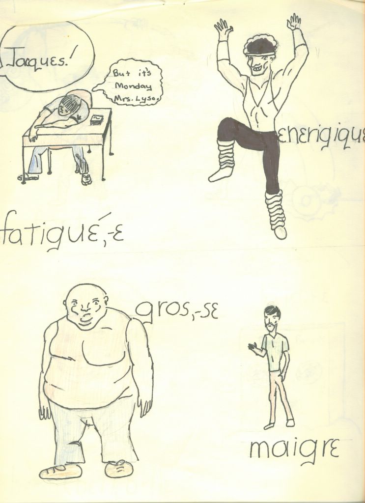
Speaking of which, I just returnd from my first trip to Paris, France. So here is a picture that I did for a high school French class project. Yes, it is silly. But it was fun to hand in a piece of cartooning and call it eduction.

Apprécier !

Untitled (from Freshman Year French Class)
9x12, pen & ink with colored pencil on paper Posted by Picasa

Tuesday, April 25, 2006

What are my artistic influences?

A question that I get often asked is, “What are my artistic influences?

First and foremost is
Frank Frazetta. I wish I had 10% of his talent. His work awes and humbles me. The man had a stroke a few years back, paralyzing his right hand (painting hand). So what does he do? He teaches himself how to paint with his left hand, never mind that by this point he is in his 60's (or 70's). The resulting work is still more amazing, real and creative than anything that I could ever do. Why I have not visited his museum is beyond me.

The other two painters would be
Chris Achellios and Royo. I really want to paint the sci fi/fantasy type art like they do (see “Sword of Royo”, so named for Royo. . .obviously). I was not confident that I could paint figures in pastels with the necessary level of detail and I did not want to pencil and ink landscapes (yup, call me lazy) with that much detail either. So I developed a hybrid mixed medium method that actually worked out pretty good for me. As you can see, the pencil work is pretty simple, most of the details of the figure were done with the colored pencil (something that Johnie C showed me). Most of the pictures done in this style, unfortunately for me, was done before I had access to a scanner (well before the digital camera age), and since I gave them away, I no longer have access to them.

::sigh::

In terms of comic book art, the career path that I would forsake all other for, I am most heavily influenced by
Michael Golden (whose style I aped in my early teens). I so wanted to be the next Michael Golden. Two others are John Byrne and Frank Miller. I never tried Miller's "Sin City" style, but his older work, like Ronin, really influenced my pencil work. I was so totally in to cross hatch because of that.

Now that I paint landscapes, I have researched the impressionists like Monet and Van Gogh (not saying I am in that stratesphere of artists, but I do try to learn from them). Still learning about color, so I think that my painting style will continue to evolve. Which is probably a good thing.

I am sure that there are others, but those are the biggest influences.

Sword of Royo
9x12, pastel with colored pencil and inks on bristol Posted by Picasa

Sunday, April 16, 2006

That's me with the hockey stick!

Found it!

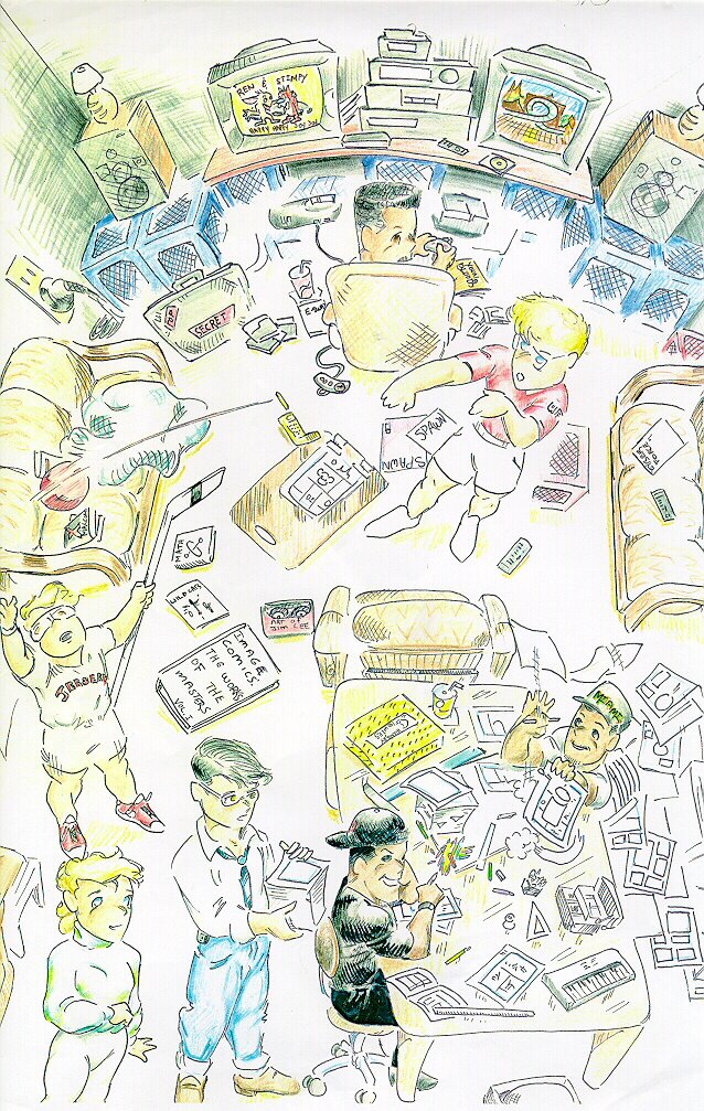
Welcome to my grad school apartment, circ 1993. That is me with the hockey stick, Anthon-Z playing sega, Coney shooting hoops, Johnni C (the artist of this picture) and Stacy at the table drawing, with special guest appearances by Ax and Dale.

I must admit, Johnie was one of the most talented artists that I ever met. He could draw just like Shiro, imho. Too bad he was never able to break into comics. I think his manga like style was way ahead of the curve. It would be another year before Joe Mads broke that style wide open and became the regular artist of the X-men. But for me, Johnie C was the originator.

Man, I still wish I had some of the pages that he penciled and I inked. And Anthon-Z's pages for that matter. I will post the splash page that Anthon-Z penciled and I inked and colored very soon. It is the best comic book related work that I have ever done. No question.

Dragon Sun-the early years. Posted by Picasa

Tuesday, April 11, 2006

One of my favorites

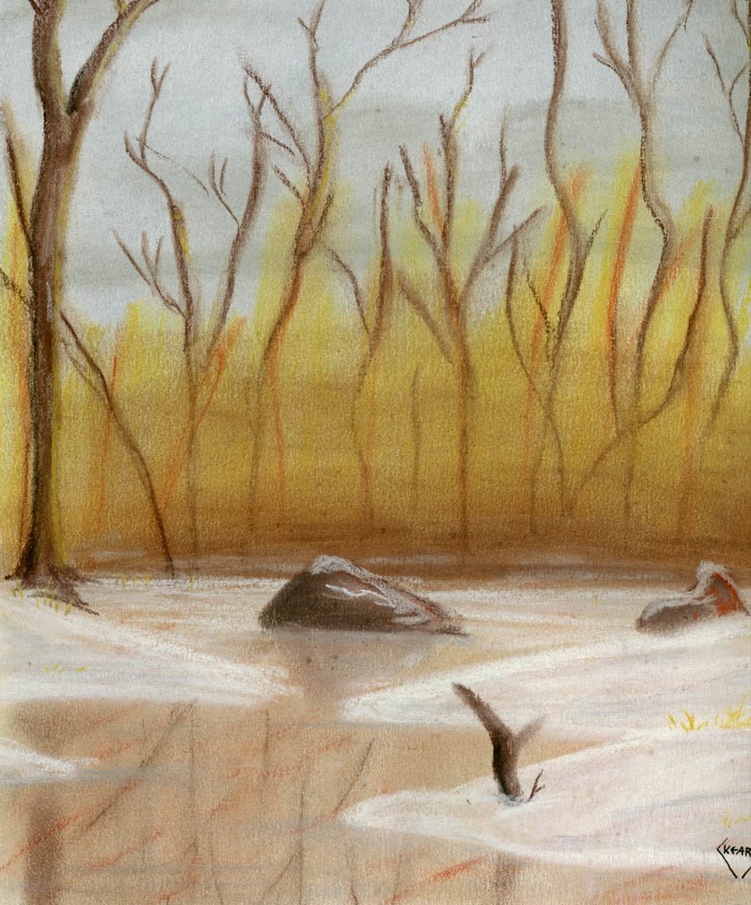
I just like this one (see "Frozen Bog" below). It is, for me, very difficult to make "dark" pastel paintings but with this painting I was able to achieve something I felt had a very "atmospheric" feeling to it. I was also able to give this piece a feeling of depth, something that I struggled mightily with for a time.

Again, this was painting around the same time as "Poppies". In fact, this, and all the others from that period that I will be posting in the next weeks, were all painted in the same spiral notebook. Now, I tape individual pieces of pastel paper onto an board and frame them when they are finished.

I believe that I have definitely grown as an artist in the last 10 years, but I have fond memories of this time when I began to relearn to paint. It was also a time when my apartment doubled as the hang out and official head quarters for for Dragon Sun Studios
Johnie C, Anthon-Z, Def Stacie, Coney and my boy Charlie "F'K'N" Ward (okay, he existed only as his EASports digital self, but he was always there). In truth, somebody was awake 24/7, either drawing something or playing Sega or Nintendo. Ah yes, those were the days.

Now I am going to have to find Johnie's "Mangaverse" version of my apartment.

Frozen Bog
9x12, pastel on paper Posted by Picasa

Tuesday, April 04, 2006

Even more from the archives

Okay, I admit it. I have been a big slacker and have not been painting at all of late. But I do, have a host of paintings from my archives that I had previously been unwilling to post.

Why?

Well, I have signed my name to them and I had been clinging to my "anonymity" of my blogger name. But realistically, the only people who don't know my real name are the ones who did not care to take 10 seconds to figure it out.

With that said, here is a painting that I did over 10 years ago when I first began to "relearn" painting. In high school, I wanted to go to Art School instead of a 4 year college. When I decided to go to a 4 year college I more or less stopped painting and drawing. Can not really explain why, but I did. At some point in during graduate school I decided to start painting again. "Poppies" is one of the first painting that I did from that period. I did not know about workable fix or different grades of pastels. I just painted this all in one layer. I think it holds up well, all things considered.

So, since I know that even if I do start a painting in the next few days, I will not have anything to post for a few weeks. Therefore, I am going to start dipping into my archives and bring out some paintings from 10 years ago.

I hope you all enjoy.

Poppies
9x12, pastel on paper Posted by Picasa

Tuesday, March 07, 2006

More from the Archives. . .

Because I really needed to post something but have had absolutely no time to do any actually drawing or painting. On top of my regular work, I agreed to write two review articles and try to rework my masters to something that is publishable. These are all things that I want to do, but they kinda cut into my free nights. Yeah, yeah, I know suck it up and stop complaining.

::sigh::

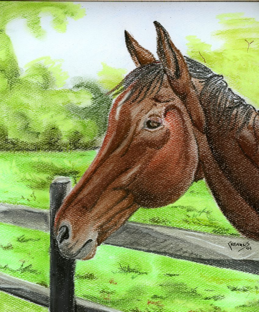
I like this picture of Rye. The pastel pigment from the top of his head was sort of rubbed off when the painting was stored in the pad. This painting was done before I knew what either workable fix or glassine paper was and how both can save the pastel pigment from rubbing off. If I still owned this, I would propbably hit it with workable fix and correct this problem.

Rye
9x12, pastel on paper
Many of my friends have asked me to paint pictures of their horse. Jess was the only one to actually provide a photo. To everyone else, I am still waiting. Posted by Picasa

Monday, February 06, 2006

Vizzini. . .he said to go back to the beginning

And so I have. Instead of continuing to stare at the rough sketch of the polar bear, hoping to get up the courage to start using my watercolors (and new Niji waterbrushes) to finish the painting, I decided to try something else in the interim. And like Vizzini said, I have gone back to the begining and my roots. Sketching.

Usually I do tons and tons of cross-hatch (sometimes too much) but for this I wanted to do something a little more down and dirty with the shading. Something a bit more basic. So, I used my trusty ol' #2 pencil, and you just don't get more basic than that.

I do plan on finishing the polar. . .hopefully even soon.

Lucky Dog
9x12, pencil on bristol Posted by Picasa

Thursday, January 26, 2006

Ah yes, I remember it well. . .

Prom stole it from Paul's blog. Now I am stealing it from her.


"please post a comment here on my blog with a completely made up and fictional memory of you and me. Anything you want—positive or negative—but the original said please keep it clean but you don't have to do that here. And remember: it has to be fake! After you've left your comment, post this little paragraph on your own blog—and be surprised (or mortified) about what people don't actually remember about you."
Monday, January 23, 2006

As you wait for updates. . .another quiz

Your results:
You are Superman
Superman
75%
Spider-Man
70%
Green Lantern
60%
The Flash
60%
Supergirl
55%
Robin
50%
Iron Man
50%
Hulk
50%
Wonder Woman
35%
Catwoman
35%
Batman
30%
You are mild-mannered, good,
strong and you love to help others.
Click here to take the "Which Superhero are you?" quiz...

Sunday, January 15, 2006

Here is to hoping I am more productive

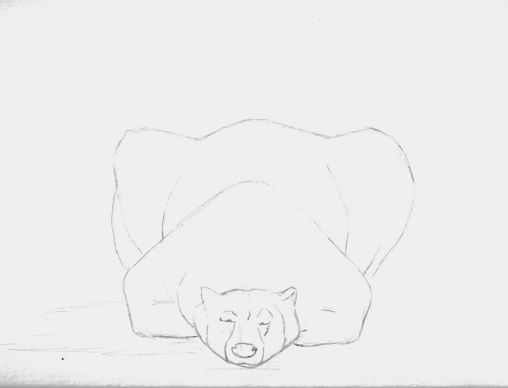
In an attempt to get my self motivated again to paint/draw, I have posted the initial sketch of a polar bear that I have wanted to paint for a while. For this, I want to try something a bit different. I am going to use watercolors, something that I am not very proficient in, and augment the painting with pastels, something that I am more comfortable using. It could be cool, as I have seen some nice pictures done in this technique. Or it could be a big mess, but at least I am attempting to stretch myself. And isn't that what this is all about?

Either way, I will post the picture in stages. . .let's see what happens.

Polar Bear
14x11, pencil on watercolor paper Posted by Picasa

Wednesday, January 11, 2006


National De-Lurking Week

Because everyone else is doing it. . .and I have not started painting the picture that I have been meaning to. . . Posted by Picasa

Wednesday, January 04, 2006

An older piece

In a effort to be more active on this blog, I have dug through some of my older work. I am really surprised that I have not posted this one before. This is the only painting that I have done on artagain, a thick black fiber-enhanced paper. The black paper gives this piece a neat and ominous air.
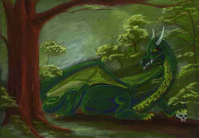
As always, this is something I should try/use more often.

Dragon
9x12, pastel on artagain Posted by Picasa

Tuesday, January 03, 2006